PROJECT OVERVIEW
Old School is a dating app that arises from pain points of present dating apps. Old school is built for people to meet like-minded friends with common interests, for platonic relationships. With the keyword-searchable function, Old school encourages you to filter through users to find those you have something in common with using hashtag optimization.
Project Details:
Duration | 4 Week
Type | Academic Individual Project
Tools | Sketch, Principle, Adobe Xd, Photoshop
Deliverable | High-fidelity interactive prototype
My Role for this project which include: Research, User Testing, UI Design, Interaction Design, and Prototype Development. One of the first things I did was test the current online dating app on some user's to see what their experiences said about the experience. I created initial wireframes and tested them which led to high-fidelity mockups and an interactive prototype.
FINAL MOCKUPSRESEARCH PROCESS
Competitive Analysis
Creating a competitive analysis was my way of exploring what is and what is not working for some existing dating applications.
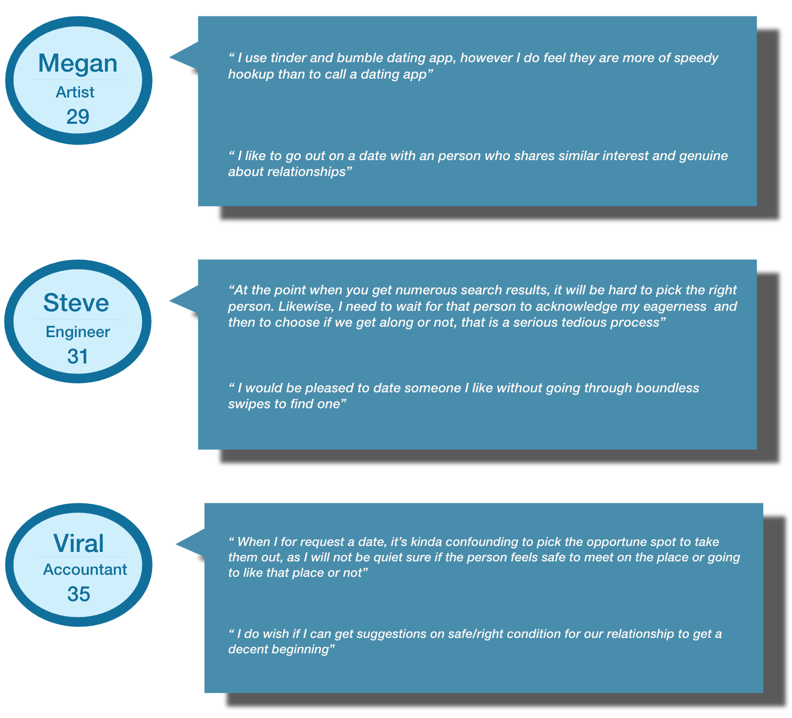
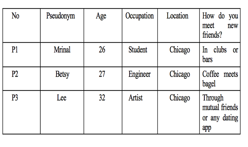
User Interviews
RESEARCH SYNTHESIS : Empathy
Interview Takeaways
● A huge takeaway from user interviews was that online speedy hookup lost sight of what it takes to build real, solid, healthy relationships.
● Providing an infinite variety of search results makes users confused and troublesome. People have become robotic after they begin obtaining overwhelming invitations and result in dating apps.
● Failed to grant time in selecting proper and the best result that matches with our interest.
● Focus totally on appearance and find it difficult to find matches based on hobbies, interests, etc due to which people spend lot of time with unsuccessful and awkward dates.
● Security :Not knowing if the place is safe to meet.
DESIGN PROCESS
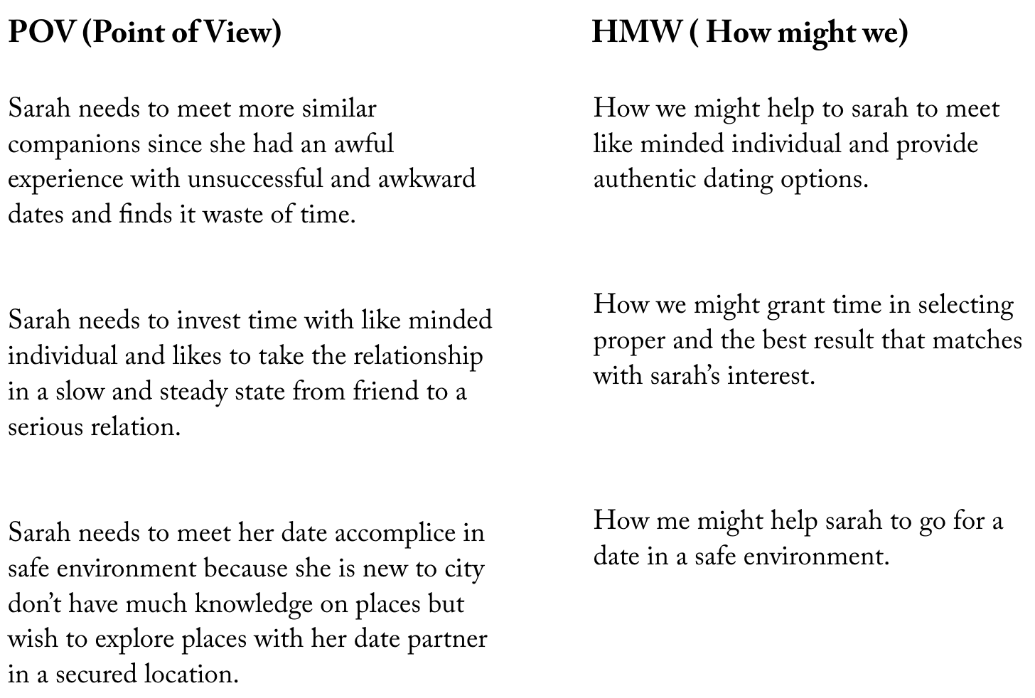
PERSONAI created a user persona, Sarah, who represents the whole discovery phase. Referring back to her during the design process helps me stay aligned with user goals and remind me of the problems I need to solve for users.
DEFINE & IDEATEPOV statements and HMW questions
Now that I have understood Sarah’s needs, I created the POV statements that would allow me to empathize with her and focus on her, giving me the right framing on defining our problem statement. From these POVs, I created HMW questions, which directly address Sarah’s needs, to help generating focused ideas.
STRATEGYProject Goals
To begin generating as many ideas as possible to address the HMW questions, I brainstormed each HMW question and reflected on the business goals and user goals, and then identified common areas that would serve as a guide in deciding necessary features.
INFORMATION ARCHITECTUREApp Sitemap
Building from the business and user goals I have determined the important features for the product, and created an app map that includes the main screens and features to have a clear structure of content within the app.
TREE-JACK TESTINGTo test the navigational structure and label contents I performed tree jack test using optimal workshop tool.
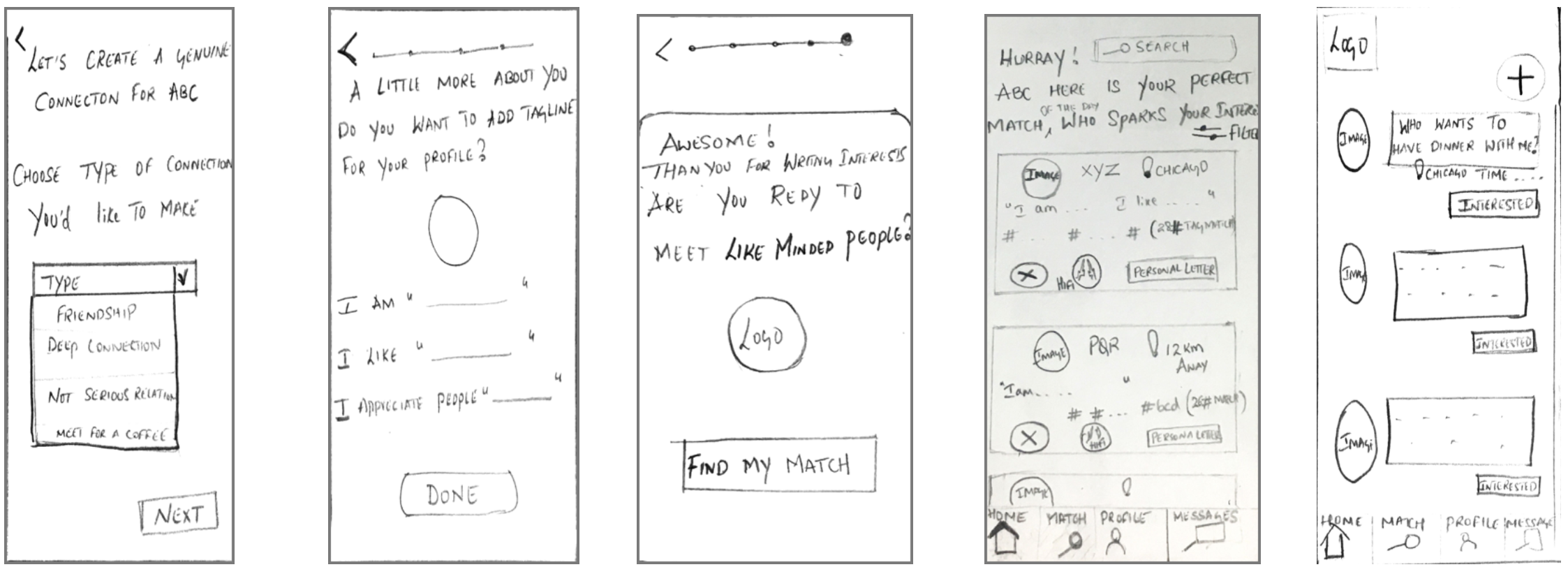
INTERACTION DESIGNWireframe: Sketches
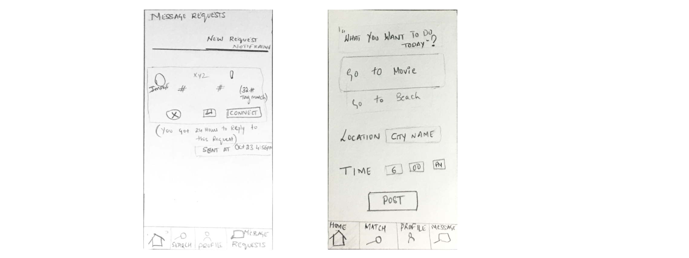
Before going digital, I sketched out the key screens necessary for fulfilling the tasks in the user flow. Sketching first allowed me to brainstorm different ideas on how to design different screens effectively. Each screen has been designed so that the user is able to focus on one main task, addressing the "lack of simplicity in navigation" that was found during tree jack testing
PROTOTYPINGInteraction Design: Mid-Fidelity Prototype
I translated my sketch into digital wireframes and added interaction between frames to produce an interactive prototype; This prototype will be used for testing. Mid Fidelity Wireframes were used for testing to quickly gain insights about the functionality and navigation within the app, and to be able to iterate on the designs at an earlier stage.
MID-FI PROTOTYPE
USABILITY TESTINGIn order to test the overall quality and ease of navigation throughout the whole design, and to observe areas of errors/difficulties, I went out and had 3 participants (2 male, 1 female) interact with my prototype.
I performed usability testing using Mid-fidelity prototypes created in Axure and sketch tools.
Task 1:User accessibility Build User Profile to understand content and flow of the app is consistent to reflect the user’s expectations i.e., action items, utilizing features, ease of use.
Task 2: Search functionality: Search Engine results based on #interests (To understand user opinion and feedback on search results)
Task 3: Report User (for better search engine optimization and to maintain a safe and positive environment)
Task 4:Invite people to an event (Maximizing user safety and security risks during face to face shared activities)
Inclusion Criteria
I asked participants the following inclusion questions:
i. Are you over 18 years of age?
ii. Do you regularly use a smartphone?
iii. Are you interested in meeting New Friends or individuals to Date? (If NO, terminate.)
DESIGN ITERATIONMid-Fi Wireframes Update
After gaining insight and prioritizing recommendations, I tweaked our mid fidelity wireframes to reflect the solutions.
1. For our second task ,to understand user opinion and feedback on search results using hashtags.
One of the three participants was tedious to provide hashtags and said “ I would be happy if app can suggest more keywords related to my interest”
2. I observed that many of the participants were not able to find the new request option directly from homepage page. Also, I discovered that the new request is an important feature which is required on the bottom navigation.
Takeaways
Prioritizing the most important features for a old school app, providing the users with an effective structure of content, and allowing simple navigation were the focus of this project. Having a optimized and limited #match result features focus main task, along with the simple and clear user interface that the users need is what differentiates this app from its competitors.
Next Steps
1. Design Implementation and more research on #hashtag algorithms.
2. Maintenance - continue to iterate and test designs.
3. Getting the app live


