Clickx Dashboard
Introduction
In 2016, OneIMS digital marketing company launched an website analytical software called Clickx in order to monitor agencies online marketing metrics. This tool helps in providing consistent value to agency to increase revenue and scale-up digital marketing agencies.With OneIms, Clickx will deliver the first fully integrated platform for sales excellence that includes Clients list, leads ,sales readiness, smart sales tutorials, and powerful sales engagement capabilities(ads) to drive meaningful conversations and increase sales.
The Challenge
How do we fully integrate an dashboard using existing platform while overhauling UX, UI, and framework?It was a large cross-functional effort to integrate and redesign the UX, UI, and framework of Clickx dashboard to improve usability for agencies and internal managers. Over a series of months we achieved this challenge with designers, developers, and go-to-market teams.
Components
Manager Experience
Agency/Admin Experience
MY ROLE TIMELINE TEAM
UX Researcher & Designer Jan - Mar 2020 UX Researcher & Designer(2),
Business Lead and Developer.
BACKGROUND
Digital marketing agencies rely on a wide range of marketing tools to deliver the best results to their clients fast and efficiently. However, multiple agency services create challenges when it comes to reporting results to clients. So how do you reduce repetition and create stunning, on-brand marketing reports that display the value of your agency’s work? With Clickx agency analytics tools, create stunning marketing analytics and automated client reporting across all your marketing channels – all from one easy to use platform.Clickx is an all-in-one digital marketing platform that gives clients the incredible convenience to effortlessly monitor marketing performance from social, local, SEO, and PPC.
Each agency can have n number of clients to manage, so this process can be tedious and time-consuming.Hence clickx tool helps agencies to evaluate the overall performance of clients site.
Understanding the domain
We met with multiple key stakeholders for several weeks to whiteboard, document, and discuss the domain, business requirements, and user needs.
While digital marketing agencies are the primary user for this process, many other roles also provide support for the process.
Gathering existing and new knowledge to determine the best dashboard structure.
We first focused on understanding what target users(agencies) need and want based on past research & interviews, heuristic analytics, and a intranet survey. Then, we determined issues with the existing navigation. Insights from these informed our final recommended structure.
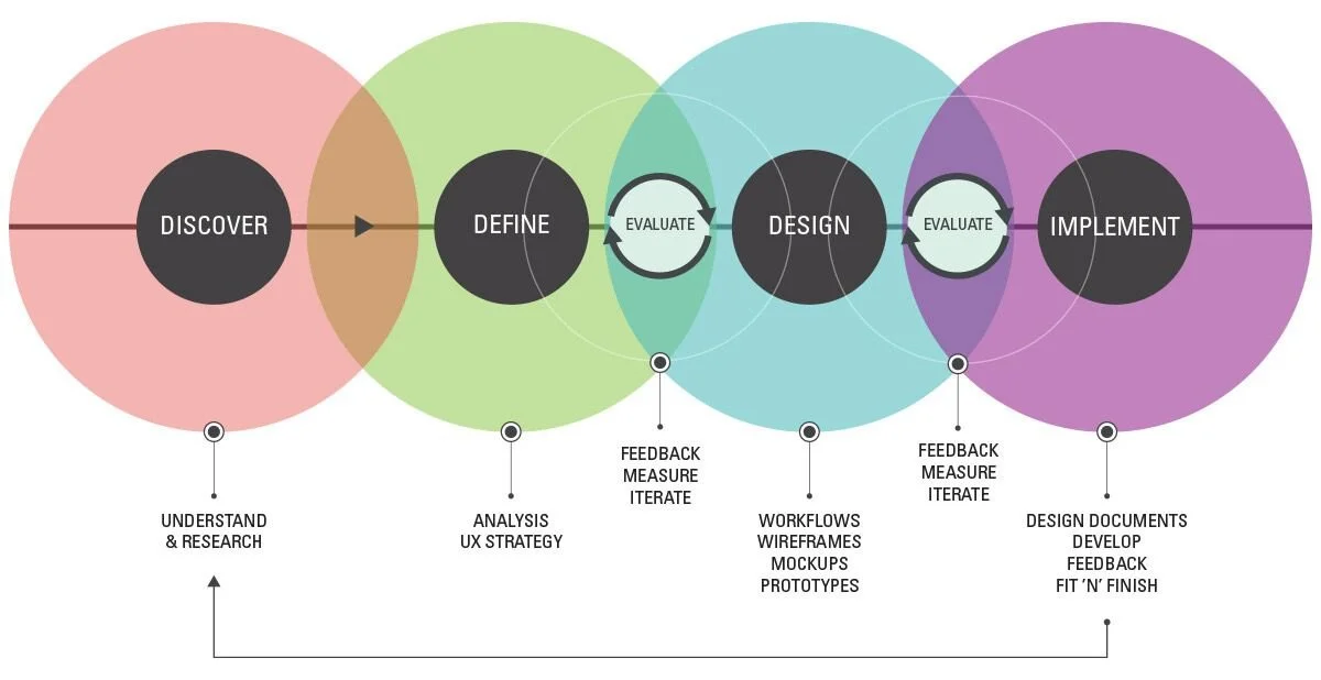
PROCESS OVERVIEW
UNDERSTAND & RESEARCH
Interviews
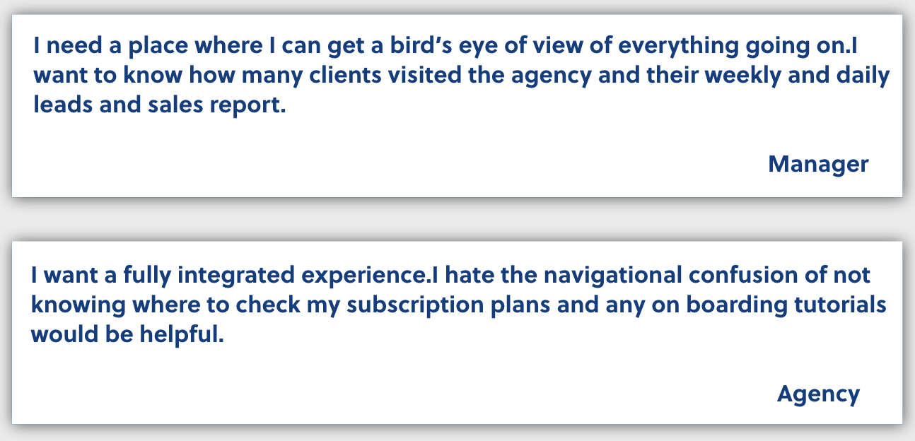
Before I got started on design my team and I interviewed both OneIMS mangers/admins and agency customers. Our goal was to understand our user’s pain points and how we could solve them. We conducted dozens of interviews and discovered several issues that our customers experienced with the learning platform. We decided prioritize agency experience UX/UI needed a full overhaul in order to solve for these issues.
Competitive Analysis
Before starting design my I researched a number of competitors in the learning space. I looked at the full experience to get a better understanding of UX patterns, concepts, UI styling and interaction. I learned what works well and what missed the mark. Taking these new learnings, I applied it to design and product to come up with the best possible experience for our agencies.
PAST RESEARCH & ANALYTICS
HEURITSIC ANALYSIS
Based on the applicability and relevance to our design, we selected 10 heuristic principles, on the basis of the heuristics laid out by Nielsen and Molich (1990).
INTRANET SURVEY
In a survey conducted OneIMS clients of 90 agencies on their Clickx tool experience and 30 internal users self-reported the number of client visits, Sales (Leads & conversions) and subscription plans as most frequently used and most valued.
WEB ANALYTICS
Web analytics from Nov 2020 to Feb 2020 showed that the primary navigation items with the greatest clicks were:
Client visits (35%)
Sales & Leads (31%)
Clickx Tutorial (~21%)
Subscription Plans (~27%)
Support(~9%)
Branding &Badging(~4%)
PRIORITIZING FEATURES
Since the target users who use clickx are mainly agencies and features should be designed from a agency perspective than internal user hence we prioritized features that are greatly used by agencies (areas we had changed drastically from the current structure, areas that were more ambiguous or confusing, etc.)
CURRENT STATE
Pain points and usability issues in the current Structure.
To determine how to proceed, we first focused on understanding the issues with the current workflow. Are there existing pain points? Where can usability be improved?
The current workflow is confusing and cumbersome.
We took a look at the structure of the current navigation and identified issues based on standard usability principles as well as user feedback from past research and the intranet survey
Recommendation: Prioritize features based on agency needs. Design a dashboard that is more broad than deep.Choose a consistent call to action functions and clearer labels.
RECOMMENDED STRUCTURE
Navigation structure proposed based on research, current usability issues, and business priorities
From past research and analytics, we determined how to best order the dashboard features. Client visits & Sales Leads, the most valued and frequently used information, were moved upfront in the dashboard for easy access.
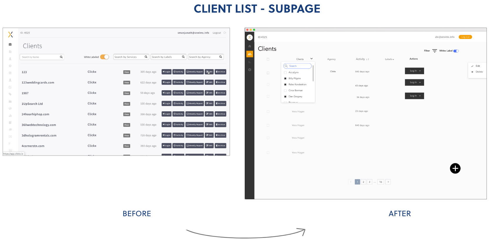
Overall groupings were based on managers and agencies' responses from the past research and analytics. Clearer labels were selected to reduce confusion and ambiguity under client list sub page, since style guide consist of grey and white contrast we couldn’t do much changes on font color selection . Finally, the dashboard was broken down into smaller, more even chunks to improve scanability and findability.
Design Iterations
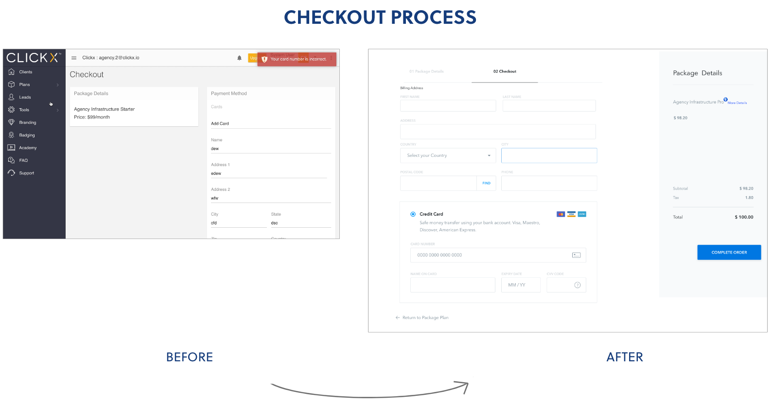
Throughout the design process, I performed multiple usability tests to develop the designs further. Each screen was redesigned and iterated upon until the team felt like we landed in the right place. We tested the designs from low fidelity sketches to hi fidelity prototypes.
OTHER WORK
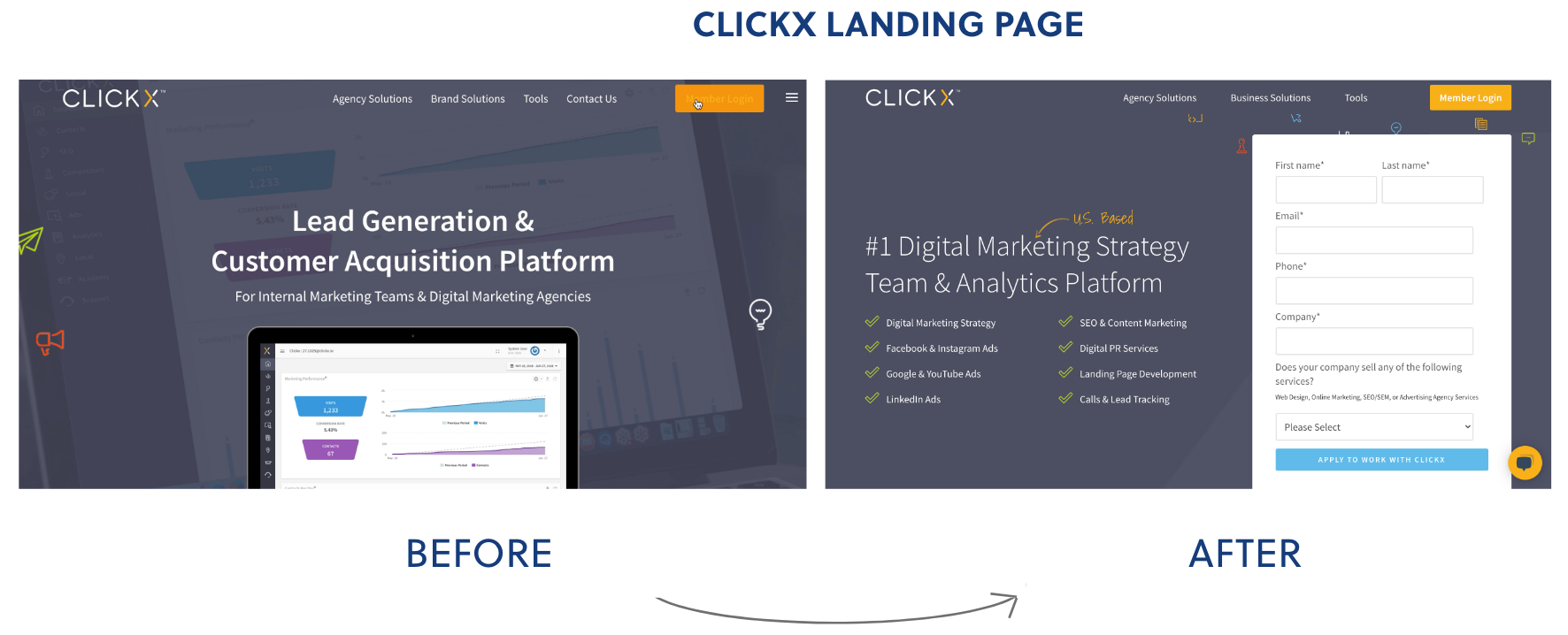
I designed and built landing Clickx page, providing an form at the homepage for new agencies/clients to contact clickx quotation directly and call to action button for members to login directly.
From Jan to March 2020, the clickx website got nearly ~ 100 potential clients filled out the form on the web page in 3 months and increased conversion rate by 9%.
LEARNINGS
Use high-level summaries to get everyone on the same page
With so much data and information to go through, it was easy to lose sight of all the considerations and subconsciously make assumptions on what's best for agency users.
I think it would have been helpful to create more high-level diagrams or summaries with my team members before starting to design the new Dashboard. This would put everyone on the same page and help ensure we were accounting for as much of this information as we could.
Consider dashboard of the site as a whole rather than in parts
Because the project scope was limited, we only focused on the dashboard. However, other parts of the site (e.g. the client page, agencies pages, other subpages sites) are also part of how agencies navigate and use the tool. Without considering these, we risked potentially creating redundant dashboard or not accounting for all the content available for agencies.Further research needs to be performed, on designing sub-level navigation pages for dashboard.


